Customer Segmentation Part 3: Network Visualization
Written
This post is the third and final part in the customer segmentation analysis. The first post focused on K-Means Clustering to segment customers into distinct groups based on purchasing habits. The second post takes a different approach, using Pricipal Component Analysis (PCA) to visualize customer groups. The third and final post performs Network Visualization (Graph Drawing) using the igraph and networkD3 libraries as a method to visualize the customer connections and relationship strengths.
3 Part Series
- CUSTOMER SEGMENTATION PART 1: K-MEANS CLUSTERING
- CUSTOMER SEGMENTATION PART 2: PCA FOR SEGMENT VISUALIZATION
- CUSTOMER SEGMENTATION PART 3: NETWORK VISUALIZATION
Customer Segmentation Cheat Sheet
We have a cheat sheet that walks the user through the workflow for segmenting customers. You can download it here.
Download the Segmentation and Clustering Cheat Sheet
10-Minute Overview of Segmentation and Clustering taught in our Business Analysis with R (DS4B 101-R) Course
Table of Contents
- Why Network Visualization?
- Where We Left Off
- Getting Ready for Network Visualization
- Developing the Network Visualization
- Visualizing the Results with networkD3
- Conclusions
- Recap
- Further Reading
Why Network Visualization?
According to Katya Ognyanova, an expert in network theory, Network Visualization is a useful technique for viewing relationships in the data, with the key benefits being identification of the following:
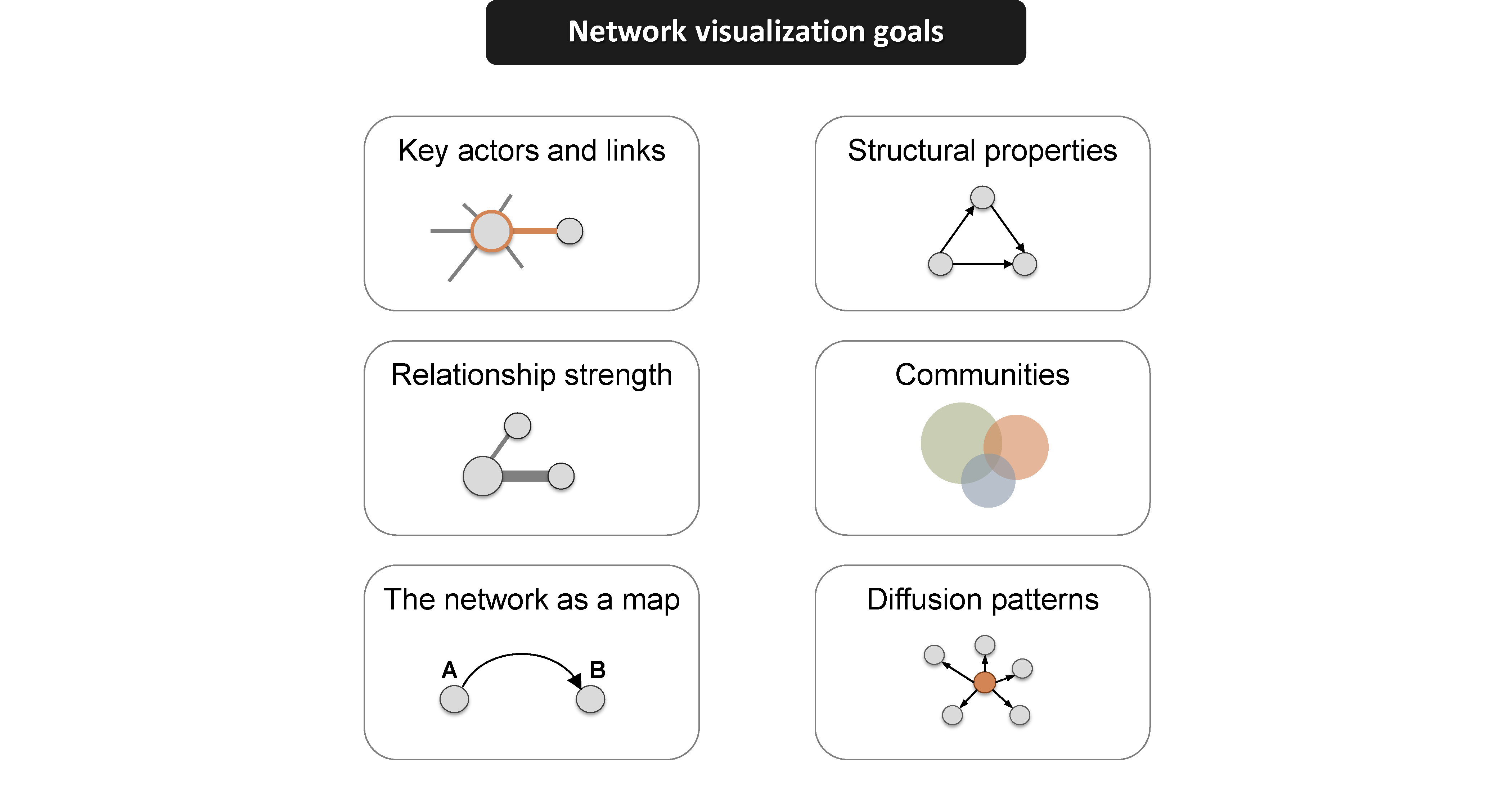
Source: Network Visualization with R
For customer segmentation, we can utilize network visualization to understand both the network communities and the strength of the relationships. Before we jump into network visualization, it’s a good idea to review where we left off in the previous customer segmentation posts.
Where We Left Off
In the first post, we used k-means clustering to analyze the bikes data set, a collection of excel files that contains data for bike shops (customers), bikes (products), and sales orders for the bike manufacturer, Cannondale. The bike shops and sales orders are fictional / simulated (see the orderSimulatoR post for more on this), but the bikes (products) are actual models from Cannondale’s website.
A hypothesis was formed that bike shops purchase bikes based on bike features such as unit price (high end vs affordable), primary category (Mountain vs Road), frame (aluminum vs carbon), etc. The sales orders were combined with the customer and product information and grouped to form a matrix of sales by model and customer. The kmeans() function was run on a range of potential clusters, k, and the silhouette() function from the cluster package was used to determine the optimal number of clusters.
In the second post, we used PCA to visually examine the customer segments using the prcomp() function in base R. PCA visualization allowed us to identify a customer segment that k-means failed to pick up.
Getting Ready for Network Visualization
For those that would like to follow along, rather than run through the previous posts the sections below can be used to get everything ready for network visualization.
Getting the Data
You can access the data here if you would like to follow along. You’ll need to download the following files:
-
orders.xlsx: Contains the fictional sales orders for Cannondale.
customer.idin the orders.xlsx file relates tobike shop.idin the bikeshops.xlsx file, andproduct.idin the orders.xlsx file relates tobike.idin the bikes.xlsx file. -
bikes.xlsx: Contains information on products (e.g. bike model, primary category, secondary category, unit price, etc).
bike.idis the primary key. -
bikeshops.xlsx: Contains information on customers (e.g. customer name and location).
bikeshop.idis the primary key.
The script to load and configure the data into a customer trends matrix is shown below.
Reading the Data
This script will read the data. Make sure you have the excel files in a folder named “data” in your current working directory prior to running the script below.
# Read Cannondale orders data --------------------------------------------------
library(xlsx)   # Used to read bikes data set
customers <- read.xlsx2("./data/bikeshops.xlsx", sheetIndex = 1,
                       colClasses = c("numeric", "character", "character",
                                      "character", "character", "numeric"))
products <- read.xlsx2("./data/bikes.xlsx", sheetIndex = 1,
                        colClasses = c("numeric", "character", "character",
                                       "character", "character", "numeric"))
orders <- read.xlsx2("./data/orders.xlsx", sheetIndex = 1, colIndex = 2:7,
                     colClasses = c("numeric", "numeric", "Date", "numeric",
                                    "numeric", "numeric"))
Manipulating the Data
The script below combines the orders, customers and products data frames into orders.extended, which is a data frame that simulates output we would get from an SQL query of a sales orders database / ERP system. The data is then manipulated to form customerTrends, which has the data structured such that the rows contain products and the columns contain purchase quantity (as percentage of total) by customer.
# Step 1: Combine orders, customers, and products data frames ------------------
library(dplyr)
orders.extended <- merge(orders, customers, by.x = "customer.id", by.y="bikeshop.id")
orders.extended <- merge(orders.extended, products, by.x = "product.id", by.y = "bike.id")
orders.extended <- orders.extended %>%
  mutate(price.extended = price * quantity) %>%
  select(order.date, order.id, order.line, bikeshop.name, model,
         quantity, price, price.extended, category1, category2, frame) %>%
  arrange(order.id, order.line)

# Step 2: Group by model & model features, summarize by quantity purchased -----
library(tidyr)  # For spread function
customerTrends <- orders.extended %>%
  group_by(bikeshop.name, model, category1, category2, frame, price) %>%
  summarise(total.qty = sum(quantity)) %>%
  spread(bikeshop.name, total.qty)
customerTrends[is.na(customerTrends)] <- 0  # Remove NA's

# Step 3: Convert price to binary high/low category ----------------------------
library(Hmisc)  # Needed for cut2 function
customerTrends$price <- cut2(customerTrends$price, g=2)

# Step 4: Convert customer purchase quantity to percentage of total quantity ---
customerTrends.mat <- as.matrix(customerTrends[,-(1:5)])  # Drop first five columns
customerTrends.mat <- prop.table(customerTrends.mat, margin = 2)  # column-wise pct
customerTrends <- bind_cols(customerTrends[,(1:5)], as.data.frame(customerTrends.mat))
Note that if the code above seems confusing, I recommend stepping through each step in the code chunk separately, then stopping to view the data frame that is created. the intention is to build the orders data frame and then convert it into a data frame that relates customers to the product purchase history.
Here’s the first 6 rows of customerTrends:
customerTrends %>% head() %>% knitr::kable() # First 6 rows| model | category1 | category2 | frame | price | Albuquerque Cycles | Ann Arbor Speed | Austin Cruisers | Cincinnati Speed | Columbus Race Equipment | Dallas Cycles | Denver Bike Shop | Detroit Cycles | Indianapolis Velocipedes | Ithaca Mountain Climbers | Kansas City 29ers | Las Vegas Cycles | Los Angeles Cycles | Louisville Race Equipment | Miami Race Equipment | Minneapolis Bike Shop | Nashville Cruisers | New Orleans Velocipedes | New York Cycles | Oklahoma City Race Equipment | Philadelphia Bike Shop | Phoenix Bi-peds | Pittsburgh Mountain Machines | Portland Bi-peds | Providence Bi-peds | San Antonio Bike Shop | San Francisco Cruisers | Seattle Race Equipment | Tampa 29ers | Wichita Speed |
|---|---|---|---|---|---|---|---|---|---|---|---|---|---|---|---|---|---|---|---|---|---|---|---|---|---|---|---|---|---|---|---|---|---|---|
| Bad Habit 1 | Mountain | Trail | Aluminum | [ 415, 3500) | 0.0174825 | 0.0066445 | 0.0081301 | 0.0051151 | 0.0101523 | 0.0128205 | 0.0117340 | 0.0099206 | 0.0062696 | 0.0181962 | 0.0181504 | 0.0016026 | 0.0062893 | 0.0075949 | 0.0042135 | 0.0182648 | 0.0086705 | 0.0184783 | 0.0074074 | 0.0129870 | 0.0244898 | 0.0112755 | 0.0159151 | 0.0108696 | 0.0092251 | 0.0215054 | 0.0026738 | 0.0156250 | 0.0194175 | 0.0059172 |
| Bad Habit 2 | Mountain | Trail | Aluminum | [ 415, 3500) | 0.0069930 | 0.0099668 | 0.0040650 | 0.0000000 | 0.0000000 | 0.0170940 | 0.0139070 | 0.0158730 | 0.0031348 | 0.0110759 | 0.0158456 | 0.0000000 | 0.0094340 | 0.0000000 | 0.0112360 | 0.0167428 | 0.0173410 | 0.0021739 | 0.0074074 | 0.0095238 | 0.0040816 | 0.0190275 | 0.0026525 | 0.0108696 | 0.0239852 | 0.0000000 | 0.0026738 | 0.0078125 | 0.0000000 | 0.0000000 |
| Beast of the East 1 | Mountain | Trail | Aluminum | [ 415, 3500) | 0.0104895 | 0.0149502 | 0.0081301 | 0.0000000 | 0.0000000 | 0.0042735 | 0.0182529 | 0.0119048 | 0.0094044 | 0.0213608 | 0.0181504 | 0.0016026 | 0.0251572 | 0.0000000 | 0.0140449 | 0.0167428 | 0.0086705 | 0.0086957 | 0.0172840 | 0.0242424 | 0.0000000 | 0.0126850 | 0.0053050 | 0.0108696 | 0.0092251 | 0.0053763 | 0.0000000 | 0.0156250 | 0.0097087 | 0.0000000 |
| Beast of the East 2 | Mountain | Trail | Aluminum | [ 415, 3500) | 0.0104895 | 0.0099668 | 0.0081301 | 0.0000000 | 0.0050761 | 0.0042735 | 0.0152108 | 0.0059524 | 0.0094044 | 0.0181962 | 0.0138289 | 0.0000000 | 0.0220126 | 0.0050633 | 0.0084270 | 0.0076104 | 0.0086705 | 0.0097826 | 0.0172840 | 0.0086580 | 0.0000000 | 0.0232558 | 0.0106101 | 0.0155280 | 0.0147601 | 0.0107527 | 0.0026738 | 0.0234375 | 0.0291262 | 0.0019724 |
| Beast of the East 3 | Mountain | Trail | Aluminum | [ 415, 3500) | 0.0034965 | 0.0033223 | 0.0000000 | 0.0000000 | 0.0025381 | 0.0042735 | 0.0169492 | 0.0119048 | 0.0000000 | 0.0102848 | 0.0181504 | 0.0032051 | 0.0000000 | 0.0050633 | 0.0042135 | 0.0152207 | 0.0202312 | 0.0043478 | 0.0049383 | 0.0051948 | 0.0204082 | 0.0162086 | 0.0026525 | 0.0201863 | 0.0073801 | 0.0322581 | 0.0000000 | 0.0078125 | 0.0097087 | 0.0000000 |
| CAAD Disc Ultegra | Road | Elite Road | Aluminum | [ 415, 3500) | 0.0139860 | 0.0265781 | 0.0203252 | 0.0153453 | 0.0101523 | 0.0000000 | 0.0108648 | 0.0079365 | 0.0094044 | 0.0000000 | 0.0106598 | 0.0112179 | 0.0157233 | 0.0278481 | 0.0210674 | 0.0182648 | 0.0375723 | 0.0152174 | 0.0172840 | 0.0103896 | 0.0163265 | 0.0126850 | 0.0026525 | 0.0139752 | 0.0073801 | 0.0053763 | 0.0026738 | 0.0078125 | 0.0000000 | 0.0098619 |
Developing the Network Visualization
Going from the customerTrends to a network visualization requires three main steps:
Step 1: Create a Cosine Similarity Matrix
The first step to network visualization is to get the data organized into a cosine similarity matrix. A similarity matrix is a way of numerically representing the similarity between multiple variables similar to a correlation matrix. We’ll use Cosine Similarity to measure the relationship, which measures how similar the direction of a vector is to another vector. If that seems complicated, just think of a customer cosine similarity as a number that reflects how closely the direction of buying habits are related. Numbers will range from zero to one with numbers closer to one indicating very similar buying habits and numbers closer to zero indicating dissimilar buying habits.
Implementing the cosine similarity matrix is quite easy since we already have our customerTrends data frame organized relating customers (columns) to product purchases (rows). We’ll use the cosine() function from the lsa library, and this will calculate all of the cosine similarities for the entire matrix of customerTrends.mat. Make sure to use the matrix version of customer trends (customerTrends.mat) because the data frame version needs to be vectorized to work with the cosine() function. Also, set the diagonal of the matrix to zero since showing a customer perfectly related to itself is of no significance (and it will mess up the network visualization).
# Create adjacency matrix using cosine similarity ------------------------------
library(lsa) # for cosine similarity matrix
simMatrix <- cosine(customerTrends.mat)
diag(simMatrix) <- 0 # Remove relationship with self
simMatrix %>% head() %>% knitr::kable() # Show first 6 rows| Albuquerque Cycles | Ann Arbor Speed | Austin Cruisers | Cincinnati Speed | Columbus Race Equipment | Dallas Cycles | Denver Bike Shop | Detroit Cycles | Indianapolis Velocipedes | Ithaca Mountain Climbers | Kansas City 29ers | Las Vegas Cycles | Los Angeles Cycles | Louisville Race Equipment | Miami Race Equipment | Minneapolis Bike Shop | Nashville Cruisers | New Orleans Velocipedes | New York Cycles | Oklahoma City Race Equipment | Philadelphia Bike Shop | Phoenix Bi-peds | Pittsburgh Mountain Machines | Portland Bi-peds | Providence Bi-peds | San Antonio Bike Shop | San Francisco Cruisers | Seattle Race Equipment | Tampa 29ers | Wichita Speed | |
|---|---|---|---|---|---|---|---|---|---|---|---|---|---|---|---|---|---|---|---|---|---|---|---|---|---|---|---|---|---|---|
| Albuquerque Cycles | 0.0000000 | 0.6196043 | 0.5949773 | 0.5441725 | 0.5820150 | 0.6530917 | 0.6884538 | 0.7002334 | 0.5978768 | 0.5078464 | 0.7093675 | 0.5446492 | 0.6380272 | 0.5594956 | 0.6547042 | 0.7004260 | 0.6518819 | 0.6777294 | 0.6960022 | 0.6363207 | 0.5707993 | 0.7305334 | 0.5140454 | 0.7071841 | 0.7215378 | 0.5516854 | 0.5133781 | 0.5742002 | 0.4473463 | 0.5262326 |
| Ann Arbor Speed | 0.6196043 | 0.0000000 | 0.7431950 | 0.7192722 | 0.6592156 | 0.6620349 | 0.6040483 | 0.7386500 | 0.7564289 | 0.4220565 | 0.6025264 | 0.6672118 | 0.6457366 | 0.6989536 | 0.8870122 | 0.7440162 | 0.8124362 | 0.8508068 | 0.7319914 | 0.8752170 | 0.6297372 | 0.7734097 | 0.3701049 | 0.7219594 | 0.7822326 | 0.6049646 | 0.6840396 | 0.7040305 | 0.2977984 | 0.6616981 |
| Austin Cruisers | 0.5949773 | 0.7431950 | 0.0000000 | 0.5940164 | 0.5669442 | 0.6149962 | 0.6321736 | 0.6400633 | 0.7529293 | 0.3600130 | 0.5998858 | 0.5346083 | 0.6918423 | 0.5288644 | 0.7774333 | 0.7369872 | 0.7537841 | 0.8092385 | 0.7083957 | 0.8238060 | 0.7173744 | 0.7717719 | 0.3508169 | 0.7462988 | 0.6738986 | 0.6677525 | 0.6277214 | 0.6765133 | 0.2963872 | 0.5753771 |
| Cincinnati Speed | 0.5441725 | 0.7192722 | 0.5940164 | 0.0000000 | 0.7958886 | 0.5358366 | 0.4906622 | 0.5881155 | 0.5840801 | 0.6148244 | 0.4859399 | 0.8190995 | 0.5220178 | 0.8582985 | 0.6653056 | 0.6326827 | 0.6734630 | 0.7217393 | 0.6057358 | 0.7144663 | 0.5328109 | 0.6150989 | 0.5884739 | 0.5836405 | 0.5920849 | 0.5422443 | 0.8296494 | 0.6401309 | 0.4714808 | 0.8075219 |
| Columbus Race Equipment | 0.5820150 | 0.6592156 | 0.5669442 | 0.7958886 | 0.0000000 | 0.5185814 | 0.5309790 | 0.7042962 | 0.5234586 | 0.6141313 | 0.5104736 | 0.7938090 | 0.5372245 | 0.7807134 | 0.6335681 | 0.6013218 | 0.6266589 | 0.6613703 | 0.5650758 | 0.6378461 | 0.5721180 | 0.6128332 | 0.5935363 | 0.5948224 | 0.5692300 | 0.5193049 | 0.7784591 | 0.6046323 | 0.4425796 | 0.7480177 |
| Dallas Cycles | 0.6530917 | 0.6620349 | 0.6149962 | 0.5358366 | 0.5185814 | 0.0000000 | 0.7431264 | 0.7496033 | 0.6082637 | 0.4708646 | 0.7468975 | 0.4700985 | 0.6821557 | 0.4854827 | 0.6675449 | 0.7803219 | 0.6766304 | 0.7056240 | 0.6769829 | 0.6776227 | 0.6251085 | 0.7680813 | 0.4075283 | 0.7546924 | 0.7567971 | 0.6388616 | 0.4739439 | 0.5715158 | 0.4358491 | 0.4436880 |
Step 2: Prune the Tree
It’s a good idea to prune the tree before we move to graphing. The network graphs can become quite messy if we do not limit the number of edges. We do this by reviewing the cosine similarity matrix and selecting an edgeLimit, a number below which the cosine similarities will be replaced with zero. This keeps the highest ranking relationships while reducing the noise. We select 0.70 as the limit, but typically this is a trial and error process. If the limit is too high, the network graph will not show enough detail. Try testing different edge limits to see what looks best in Step 3.
# Prune edges of the tree
edgeLimit <- .70
simMatrix[(simMatrix < edgeLimit)] <- 0
Step 3: Create the iGraph
Creating the igraph is easy with the graph_from_adjacency_matrix() function. Just pass the pruned simMatrix. We can also get the communities by passing the simMatrix to the cluster_edge_betweenness() function.
library(igraph)
simIgraph <- graph_from_adjacency_matrix(simMatrix,
                                         mode = 'undirected',
                                         weighted = T)
ceb <- cluster_edge_betweenness(simIgraph) # For community detection
Let’s pause to take a look as the cluster edge betweenness (ceb). We can view a plot of the clusters by passing ceb to the dendPlot() function. Set the mode to “hclust” to view as a hierarchical clustered dendrogram (it uses hclust from the stats library). We can see that the cluster edge betweenness has detected three distinct clusters.
dendPlot(ceb, mode="hclust")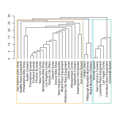
Now we can plot the network graph by passing ceb and simIgraph to the plot() function. See plot.igraph for additional documentation.
plot(x=ceb, y=simIgraph)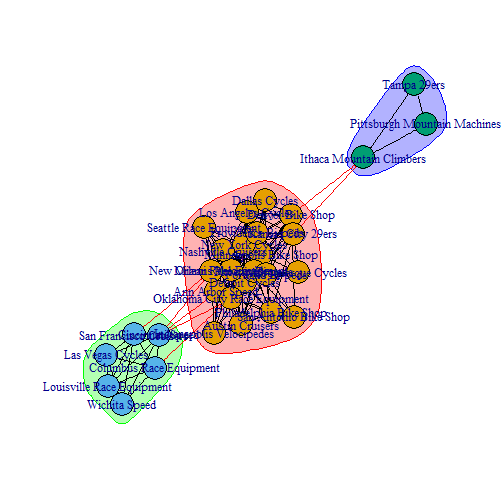
Yikes. This is a little difficult to read. With that said, the graph did a nice job of showing the major customer segments. Also notice how the color of the node clusters match the dendrogram groupings. For readability sake, we’ll take a look at what the networkD3 package has to offer.
Visualizing the Results with NetworkD3
The networkD3 library enables D3 JavaScript network graphs from R. It has an igraph_to_networkD3() function that can be used to seamlessly convert an igraph object to network3D. The benefits to D3 are interactivity:
- The names are hidden until the user hovers over the node, improving readability.
- Nodes can be dragged to manipulate the network graph for easier viewing.
- Zoom is enabled, allowing the user to zero-in on specific nodes to more easily see the edges and thus better understand relationships.
# Use igraph ceb to find membership
members <- membership(ceb)

# Convert to object suitable for networkD3
simIgraph_d3 <- igraph_to_networkD3(simIgraph, group = members)

# Create force directed network plot
forceNetwork(Links = simIgraph_d3$links, Nodes = simIgraph_d3$nodes,
             Source = 'source', Target = 'target',
             NodeID = 'name', Group = 'group',
             fontSize = 16, fontFamily = 'Arial', linkDistance = 100,
             zoom = TRUE)
Conclusion
Network visualization is an excellent way to view and understand interrelationships between customers. Network graphs are particularly useful as the data scales, as they can be pruned and viewed interactively to zero-in on complex relationships. We’ve all heard the saying a picture is worth a thousand words. A network graph could be worth many more as customers go from 30 in our example to hundreds, thousands or even millions.
Recap
This post expanded on our customer segmentation methodology by adding network graphing to our tool set. We manipulated our sales order data to obtain a format that relates products to customer purchases. We created a cosine similarity matrix using the cosine() function from the lsa library, and we used this as the foundation for our network graph. We “pruned the tree” to remove edges with low significance. We used the igraph library to create an igraph with communities shown. Finally, we converted the igraph to an interactive graph using the networkD3 package. Pretty impressive, and hopefully you see that it’s not that difficult with a basic knowledge of R programming.
Further Reading
-
Network Visualization with R: This article is an excellent place to start for those that want to understand the details behind Network Visualization in R.
-
CRAN Task View: Cluster Analysis & Finite Mixture Models: While we did not specifically focus on clustering in this post, the CRAN task view covers a wide range of libraries and tools available for clustering that can be used in addition to those covered in the three part series.
-
Data Smart: Using Data Science to Transform Information into Insight: Chapter 5 uses a similar approach on customers that purchase wine deals based on different buying preferences. This is a great book for those that are more familiar with Excel than
Rprogramming.
Business Science University
Enjoy data science for business? We do too. This is why we created Business Science University where we teach you how to do Data Science For Busines (#DS4B) just like us!
Our first DS4B course (HR 201) is now available!
Who is this course for?
Anyone that is interested in applying data science in a business context (we call this DS4B). All you need is basic R, dplyr, and ggplot2 experience. If you understood this article, you are qualified.
What do you get it out of it?
You learn everything you need to know about how to apply data science in a business context:
-
Using ROI-driven data science taught from consulting experience!
-
Solve high-impact problems (e.g. $15M Employee Attrition Problem)
-
Use advanced, bleeding-edge machine learning algorithms (e.g. H2O, LIME)
-
Apply systematic data science frameworks (e.g. Business Science Problem Framework)
“If you’ve been looking for a program like this, I’m happy to say it’s finally here! This is what I needed when I first began data science years ago. It’s why I created Business Science University.”
Matt Dancho, Founder of Business Science